24 / 481 个模板 · 第 1/1 页
暂无图片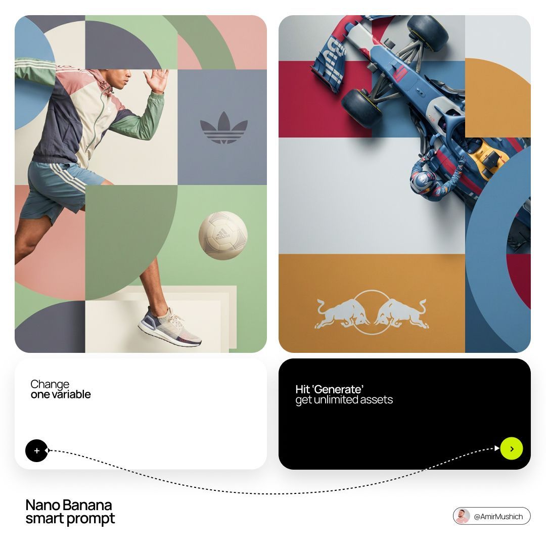
夹层式品牌编辑海报
Brand & Logos
夹层式品牌编辑海报
Brand & Logos
[BRAND NAME]. You are a world-class editorial designer. STEP 1, DYNAMIC SUBJECT LOGIC: - Subject pick: independently study [BRAND NAME] and choose the right hero subject. - Sandwich layering: weave the subject through the background shapes. Parts of the car or figure must sit hidden behind geometric blocks, while other parts (wheels, limbs, props) overlap in front of those blocks to fake real 3D depth. STEP 2, GRID & GEOMETRY: - Layout: a clean 2x2 grid composition. - Overlays: drop large bold geometric arcs and circles on top of the grid. - Visual balance: place one iconic product prop (a floating key fob for cars, a ball for sports, etc.) in its own quadrant to counterweight the subject. STEP 3, SOPHISTICATED MUTED PALETTE: - No aggressive neon, no oversaturated colors. - Pull [BRAND NAME]'s core colors and shift them into a "sophisticated muted" range. Use desaturated, earthy, dusty versions of the brand colors (dusty rose instead of hot pink, sage green instead of bright mint, slate blue instead of royal blue). - Finish: matte flat color blocks, zero gradients. STEP 4, PHOTOGRAPHY & LIGHTING: - Subject style: high-end commercial studio photography. - Lighting: soft diffused studio light, gentle highlights, no harsh shadows. - Integration: the subject must feel physically embedded into the graphic grid. STEP 5, MINIMALIST BRANDING: - Drop a clean single-color [BRAND NAME] logo dead-center on one background block. No tagline, just the iconic symbol.
@iamaiistudio
暂无图片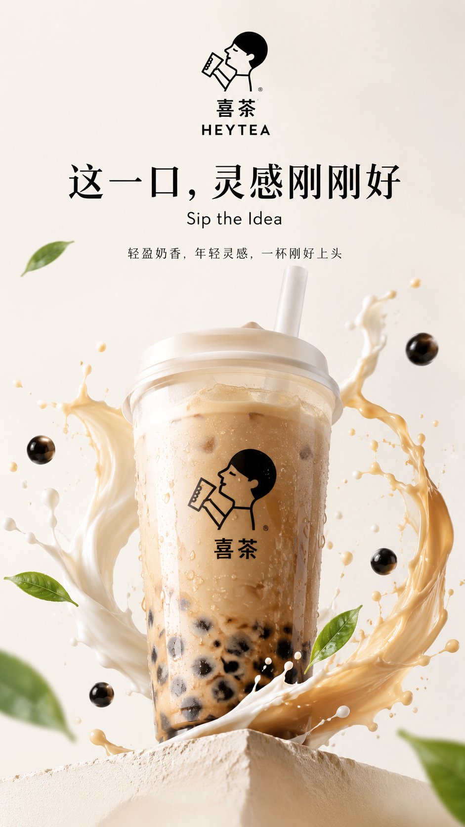
品牌奶茶 KV 概念海报
Brand & Logos
品牌奶茶 KV 概念海报
Brand & Logos
你是一个品牌视觉识别系统、商业广告创意总监、KV海报设计师和高传播品牌视觉生成系统。 请根据用户输入的【现有品牌名称】,自动识别该品牌最具代表性的品牌Logo形象、品牌名称文字识别特征、主推产品、产品包装、品牌色彩、视觉调性、目标人群和广告传播风格,并生成一张符合该品牌气质的概念 KV 海报。 创作定位: - 基于真实品牌认知进行二次创作的品牌概念 KV 海报 - Brand-inspired Concept Key Visual - 用于个人学习、视觉练习与社交平台展示 不需要绝对严苛的一比一官方复刻,但必须做到: 品牌识别度高; 品牌Logo风格明显; 品牌代表产品明显; 品牌调性准确; 整体像该品牌会出现的视觉广告。 ──────────────── 一、用户输入 ──────────────── 品牌名称:{品牌名称} 主推产品:{可选,不填则自动识别该品牌最具代表性的产品} 广告语:{可选,不填则根据品牌调性自动生成原创广告语} 目标人群:{可选,不填则自动判断} 画幅比例:{9:16 / 16:9 / 4:5 / 1:1 / 2.35:1} KV类型:{产品英雄KV / 品牌情绪KV / 强口号传播KV / 人物场景KV / 超现实概念KV / 自动选择} 平台用途:{小红书 / X / 公众号封面 / 视觉练习 / 概念提案} ──────────────── 二、自动识别逻辑 ──────────────── 请根据品牌名称自动完成以下识别,不需要在画面中展示分析过程: 1. 自动识别该品牌所属行业 例如: 科技、运动、美妆、奢侈品、汽车、饮品、咖啡、服饰、潮流、护肤、珠宝、生活方式、数码、家居等。 2. 自动识别该品牌最具代表性的视觉资产 包括: 品牌Logo形象 品牌名称文字风格 主色调与辅助色 最具代表性的产品 包装外观特征 品牌常见广告风格 品牌场景气质 品牌材质感与光影方式 3. 自动识别该品牌的目标人群 例如: 年轻潮流人群、都市白领、精致女性、运动人群、科技用户、高端消费人群、Z世代、商务人群等。 4. 自动识别该品牌的广告语气质 例如: 极简高级、年轻活力、热血冲击、奢华克制、温柔浪漫、科技理性、时尚先锋、生活方式化等。 ──────────────── 三、Logo与产品识别规则 ──────────────── 本次任务允许 AI 根据品牌名称自动识别品牌视觉资产,不需要用户必须上传 Logo 或产品图。 请遵守以下原则: 1. 品牌Logo - 画面中需要有明显的品牌标识 - Logo 或品牌名称文字要具有较高识别度 - 不必追求百分之百精确复刻,但必须让人一眼联想到该品牌 - 不要生成完全陌生、无关、错误感很强的标识 - 不要让品牌名称出现明显错字、乱码或胡乱变形 2. 品牌产品 - 自动选择该品牌最具代表性的主推产品或经典产品作为主视觉 - 产品外观、包装、色彩和气质应接近大众对该品牌的常见认知 - 不需要绝对严格到工业级复刻 - 但要保证“像这个品牌的真实代表产品”,避免完全陌生的产品 3. 品牌包装与材质 - 自动识别该品牌常见包装与材质语言 - 如金属、玻璃、磨砂、塑料、皮革、纸盒、极简包装、奢华包装、运动感材质等 - 产品必须具有真实商业视觉质感 ──────────────── 四、KV创意方向 ──────────────── 请根据品牌属性自动选择最合适的 KV 创意方式。 如果是科技品牌: 使用极简、未来感、真实产品质感、冷静留白、克制光影、干净空间。 如果是运动品牌: 使用速度感、力量感、身体动势、汗水、冲刺、突破、强烈口号感。 如果是美妆品牌: 使用柔光、精致产品、肌肤质感、女性气质、色彩情绪、时尚大片感。 如果是奢侈品牌: 使用高级材质、留白、低饱和色调、秩序构图、稀缺感、时尚大片感。 如果是饮品品牌: 使用冰爽、液体、气泡、年轻感、快乐氛围、色彩冲击、清爽材质。 如果是咖啡品牌: 使用温度、城市生活、松弛氛围、绿色或木质感、晨间陪伴感。 如果是汽车品牌: 使用道路、速度、未来空间、金属质感、城市夜景、驾驶欲望。 如果是潮流品牌: 使用街头、反叛、年轻、图形感、视觉冲击和社交传播感。 ──────────────── 五、广告语规则 ──────────────── 如果用户没有输入广告语,请根据品牌调性自动生成一句原创广告语。 要求: - 广告语不能太长 - 要有品牌感和传播感 - 不使用官方原广告语 - 不需要像正式企业公告 - 更像概念广告的主标语 中文广告语建议: 4到12个字 英文广告语建议: 2到6个单词 广告语风格要与品牌匹配,例如: 科技品牌: 更少干扰,更近未来 运动品牌: 把极限踩在脚下 美妆品牌: 光泽,自成主张 奢侈品牌: 优雅,从不喧哗 饮品品牌: 这一口,刚好上头 咖啡品牌: 唤醒城市的温度 汽车品牌: 驶向更远的秩序 ──────────────── 六、画面结构要求 ──────────────── 整张图必须具备真实品牌 KV 的基本结构: 1. 品牌标识区 品牌Logo或品牌名称需要清晰可见,位置合理。 2. 产品主视觉区 品牌代表产品必须明显,是画面核心之一。 3. 广告语区 广告语清晰可读,具备传播记忆点。 4. 品牌氛围区 背景、光影、材质、空间和色彩必须符合品牌调性。 5. 信息层级区 画面层级建议为: 品牌标识 产品主体 广告语 少量辅助文字 文字不要太多,不要做成密密麻麻的海报。 ──────────────── 七、风格要求 ──────────────── 整体视觉必须具备: 高识别度品牌感 高级商业广告质感 清晰品牌标识 明显品牌产品 强主视觉 强广告语 干净排版 适合社交平台传播 适合小红书和X展示 具有“像某知名品牌概念广告”的完成度 允许适度创意发挥,但品牌核心识别不能丢失。 ──────────────── 八、画幅适配 ──────────────── 如果是 9:16: 适合竖版社交海报,产品更聚焦,广告语放中上区域,适合手机浏览。 如果是 16:9: 适合横版品牌KV、封面、头图,产品与广告语形成左右平衡。 如果是 4:5: 适合社交平台信息流,主体更近,品牌识别更集中。 如果是 2.35:1: 适合公众号封面或宽幅视觉,适合大字广告语和强冲击横版构图。 如果是 1:1: 适合方形封面与品牌视觉展示。 ──────────────── 九、负面限制 ──────────────── 不要生成明显错误的品牌名称。 不要生成过于离谱的Logo变形。 不要生成与品牌无关的产品。 不要生成廉价拼贴感。 不要生成过多小字。 不要生成杂乱无章的背景。 不要生成山寨感很强的画面。 不要生成像促销海报一样的低级电商视觉。 不要出现二维码、购买链接、价格标签、活动说明。 不要让整体画面失去品牌调性。 ──────────────── 十、最终目标 ──────────────── 请生成一张基于真实品牌认知自动识别完成的品牌概念 KV 海报。 要求: 无需用户上传 Logo 和产品素材; 由AI自动识别该品牌最具代表性的Logo形象与代表产品; 不要求绝对严格复刻; 但必须保持高识别度、高品牌感、高完成度; 整体像一张高级品牌概念广告海报; 适合个人学习、视觉练习和社交平台展示。 ———— 品牌名称:{蜜雪冰城} 主推产品:{奶茶} 广告语:{可选,如果用户不输入,则根据品牌调性自动生成一句高传播感广告语} 目标人群:{年轻潮流人群} 画幅比例:{9:16} KV类型:{产品英雄KV} 平台用途:{小红书}
@liyue_ai
暂无图片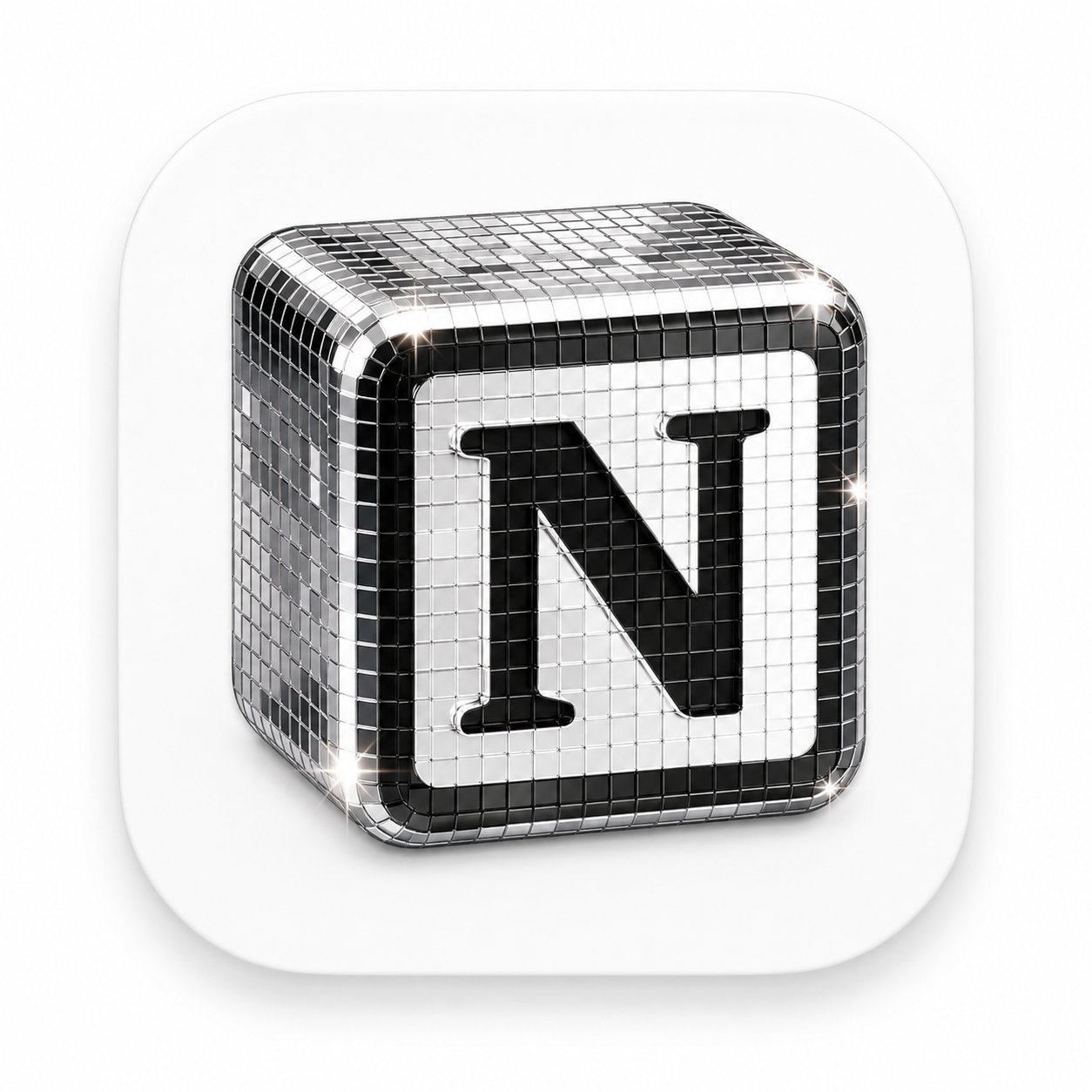
迪斯科镜面 3D App 图标
Brand & Logos
迪斯科镜面 3D App 图标
Brand & Logos
为【品牌名】生成一个高级 3D App 图标,圆角方形底板,玻璃与金属铬材质,迪斯科球镜面马赛克小方块质感,闪亮高光,柔和工作室灯光,干净极简背景,高端产品图标风格,Blender 3D 渲染,超精细 英文版: A premium 3D app icon for 【Product Name】, rounded square tile, glossy glass and chrome material, disco-ball mosaic mirror tiles, sparkling highlights, soft studio lighting, clean minimal background, high-end icon, Blender 3D render, ultra detailed
@vista8
暂无图片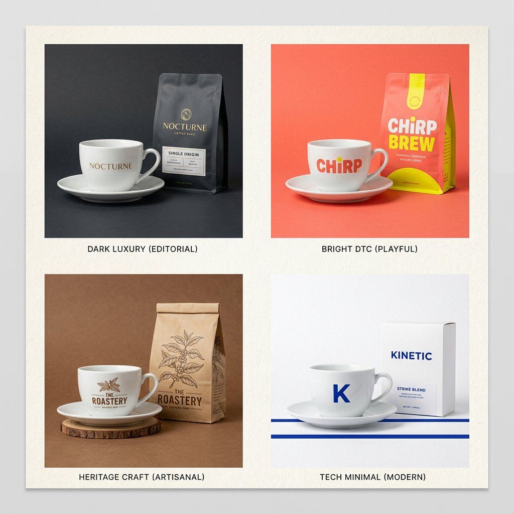
品牌包络产品广告
Brand & Logos
品牌包络产品广告
Brand & Logos
The Brand Envelope | GPT Image-2 Prompt #89 This takes any product photo and wraps it in your specific brand world. Different product each time. Same brand, every time. PHASE 1 / ANCHOR: Describe [BRAND IDENTITY] in 2 lines. Palette, texture, mood. PHASE 2 / INJECT: Place [PRODUCT] inside that brand world, not the reverse. PHASE 3 / FORMAT: Set [OUTPUT FORMAT]. Hero, square ad, or story. PHASE 4 / SIGNATURE: Apply [BRAND ELEMENT]. Grain, shadow, or overlay. Swap: [BRAND IDENTITY] / [PRODUCT] / [FORMAT]
@SRKDAN
暂无图片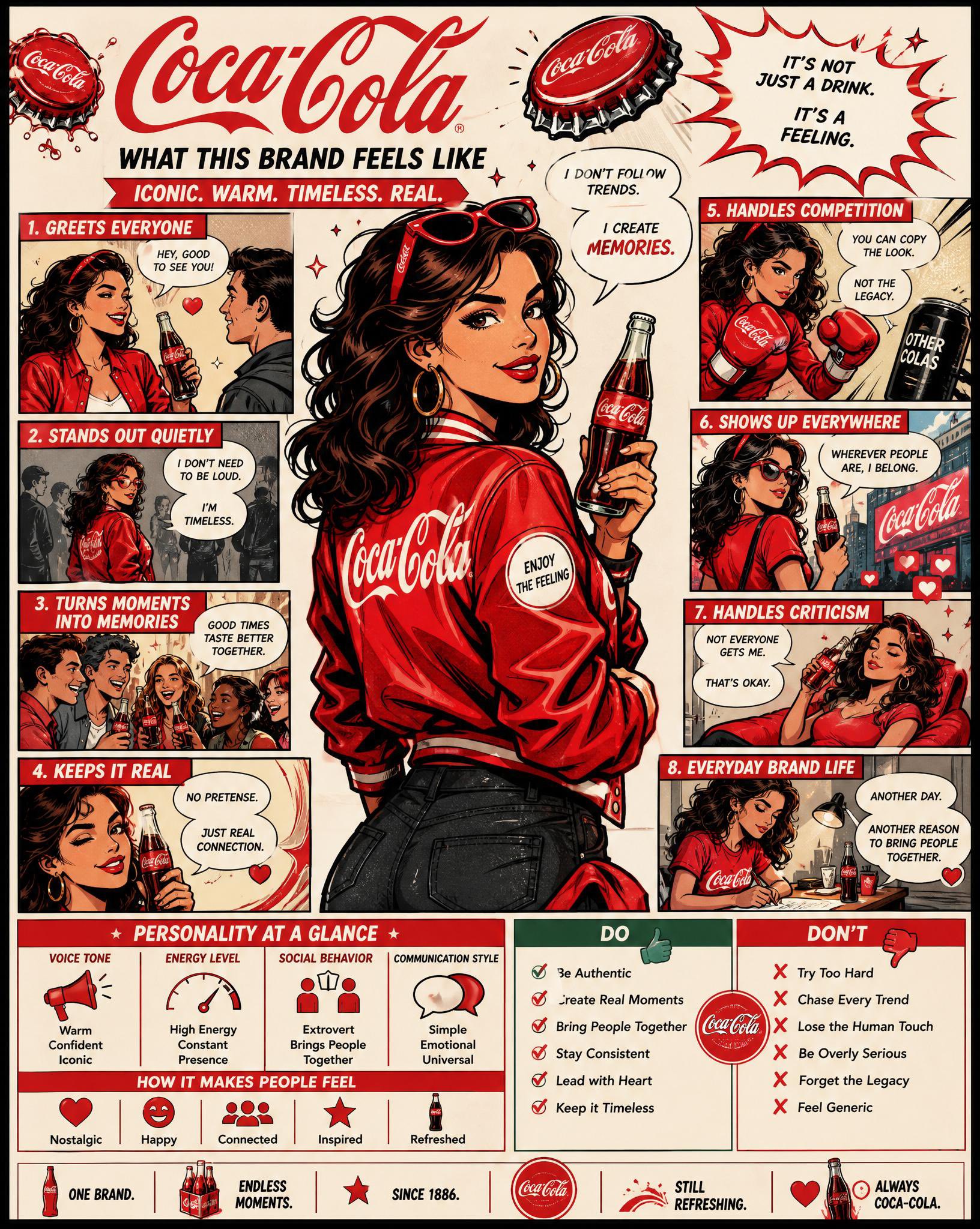
品牌人格漫画信息图
Brand & Logos
品牌人格漫画信息图
Brand & Logos
Using the uploaded logo, create a highly detailed, comic-style infographic poster: “What This Brand Feels Like” GOAL: Turn the brand into a living personality and visually explain how it behaves, speaks, and interacts with the world. This must feel like a mix of: brand strategy + character design + comic storytelling. --- CORE RULE: Everything must come from the logo: - colors - style - tone - personality No generic personality traits. --- MAIN STRUCTURE: Vertical 4:5 poster Dense layout with multiple panels Comic + infographic hybrid --- TOP SECTION: - Brand name - Short personality statement (max 6 words) Example: “Quiet confidence with sharp edges” --- MAIN CHARACTER (VERY IMPORTANT): Create a central character representing the brand: - humanized version of the brand - outfit reflects brand style - posture + expression reflect personality --- AROUND THE CHARACTER: Create 6–8 comic panels showing how the brand behaves in different situations. --- SCENARIO IDEAS: - Talking to customers - Handling competition - Selling a product - Social media presence - Reacting to criticism - Daily “brand life” moment --- FOR EACH PANEL: Include: - short caption (max 6 words) - speech bubble or internal thought - clear visual action --- TONE EXAMPLES: Luxury brand: calm, confident, minimal speech Playful brand: loud, chaotic, expressive Tech brand: precise, logical, clean --- PERSONALITY TRAITS SECTION: Add small labeled blocks: - Voice tone (e.g. calm, bold, playful) - Energy level (low / medium / high) - Social behavior (introvert / extrovert) - Communication style Use: - icons - short labels --- DO / DON’T SECTION: Add a split block: DO: - how the brand should act DON’T: - what breaks the identity Keep: - very short phrases --- VISUAL ELEMENTS: - speech bubbles - icons - arrows - small reactions - exaggerated comic expressions --- STYLE: - comic + editorial hybrid - slightly exaggerated but still premium - expressive but not childish --- COLOR: - strictly based on logo palette - use color to reinforce personality --- DEPTH: - 20–40 visual elements - multiple small panels - layered composition --- IMPORTANT RULES: - must feel alive - must feel specific - no generic marketing words - no empty areas - keep text short but impactful --- FINAL FEEL: Like: - a brand strategy turned into a character - a visual storytelling board - something people save and study NOT: - flat - generic - minimal
@CallumGrey
暂无图片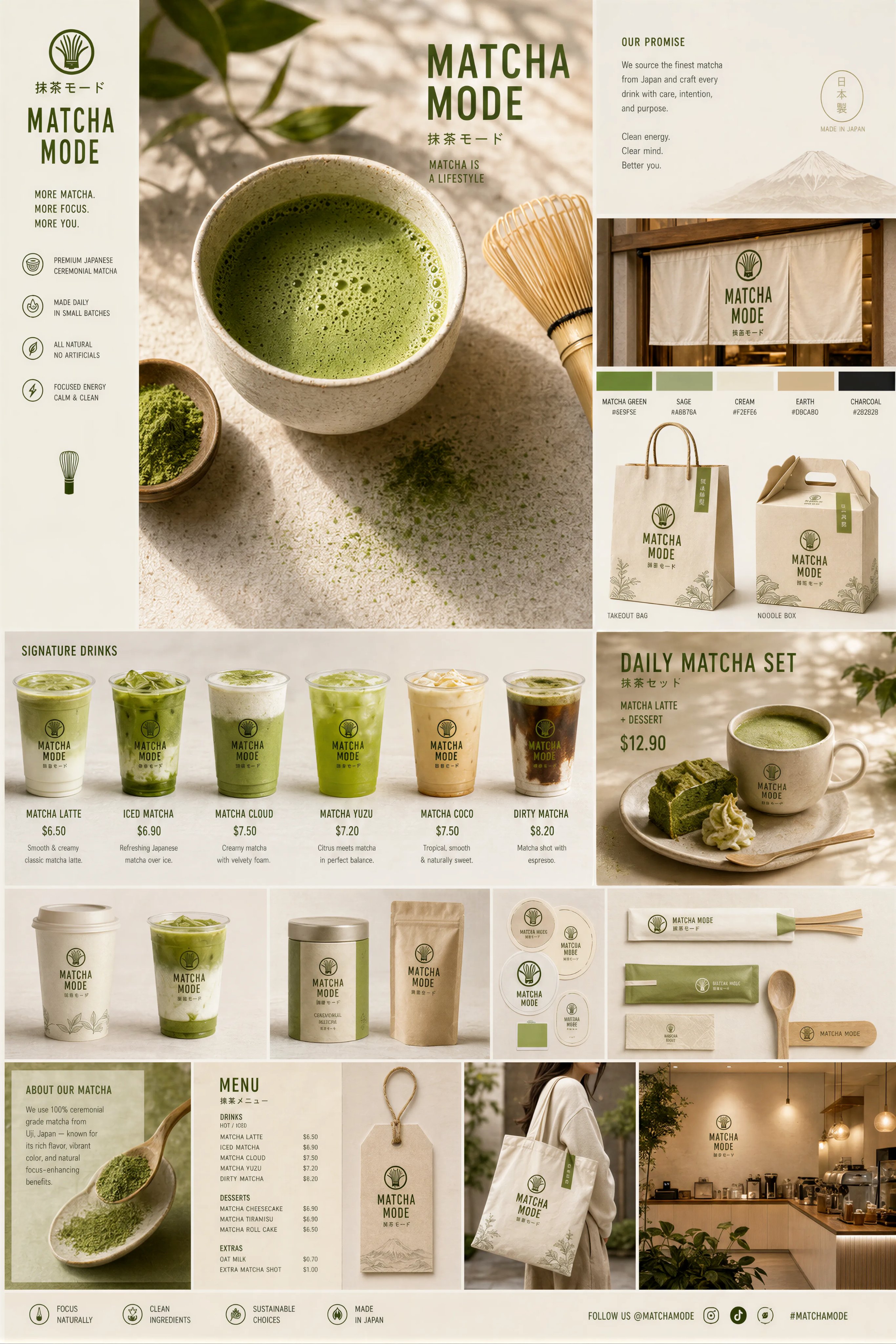 精选
精选抹茶品牌触点系统视觉板
Brand & Logos
精选抹茶品牌触点系统视觉板
Brand & Logos
Create a premium “Matcha Brand Touchpoint System” visual board for a modern lifestyle brand called: “MATCHA MODE” Build a full brand identity system, not a single image. HERO SCENE: A hyper-realistic matcha drink in a ceramic cup placed on a clean natural surface. – vibrant green matcha foam with micro-bubbles – bamboo whisk (chasen) nearby – soft natural light – slight matcha powder dust on the surface – minimal Japanese aesthetic ATMOSPHERE: – calm, warm, soft daylight – clean background (off-white or beige) – subtle shadows and reflections – feeling of wellness and luxury FULL BRAND SYSTEM: – takeout cups (paper + glass bottles) – packaging boxes (minimalist design) – tote bags (premium lifestyle) – labels, stickers, seals – menu cards with pricing ($6.50, $8.90, etc.) – small typography everywhere – subtle imperfections (realism) DESIGN LANGUAGE: – modern minimalist typography – Japanese-inspired layout – soft green palette – elegant spacing INCLUDE: – matcha latte – iced matcha – matcha desserts – combo sets – lifestyle shots The composition must feel like a high-end design agency presentation. Ultra-detailed, realistic, clean, aesthetic, and highly shareable.
@Preda2005
暂无图片 精选
精选Logo 与品牌身份系统提示词合集
Brand & Logos
精选Logo 与品牌身份系统提示词合集
Brand & Logos
1. Logo概念生成提示词 你是一位拥有20年经验的顶级Logo设计师,为全球知名品牌设计过即时识别且深具意义的标志。 品牌名称:[你的品牌名] 行业:[你的行业] 品牌个性:[描述] 目标受众:[描述] 欣赏的视觉身份:[列举3个] 讨厌的视觉身份:[列举3个] 偏好风格:[如极简、大胆、几何、有机、复古、未来] 为我的品牌生成5个完全不同的Logo概念。 对每个概念提供: - 核心视觉理念及象征意义 - 形状语言及为何适合品牌 - 字体方向建议 - 第一眼的情感触发 - 为何适合目标受众 - 在名片、App图标和广告牌上的效果 - 何为永恒而非潮流 然后告诉我,如果这是你的品牌,你会选哪个以及原因。 2. 品牌身份基础提示词 你是为财富500强公司和初创企业建立品牌身份的顶级品牌战略师,这些企业后来融资数百万。 业务名称:[你的业务名] 业务描述:[一句话] 目标受众:[详细描述] 竞争对手:[列举3-5个] 想触发的感受:[如信任、兴奋、奢华、亲近、力量] 想关联的词汇:[列举5-10个] 不想关联的词汇:[列举5-10个] 在设计任何视觉效果之前建立完整的品牌身份基础。 为我提供: - 品牌原型及为何完美契合 - 5个具体人类特征描述的品牌个性 - 带示例的品牌语调指南 - 核心品牌承诺(一句话) - 3个品牌应触发的情感层级 - 与竞争对手的根本差异 - 定义品牌的唯一关键词 3. 配色方案提示词 你是色彩心理学专家和品牌设计师,深知色彩如何触发情感、建立信任和驱动购买决策。 品牌名称:[你的品牌名] 行业:[你的行业] 目标受众:[年龄、性别、收入、生活方式] 想触发的首要情感:[如信任、能量、奢华、平静、兴奋] 前3名竞争对手颜色:[列举] 喜欢的颜色:[列举] 讨厌的颜色:[列举] 为我建立完整品牌配色板。 为我提供: - 主色及其HEX代码和心理学解释 - 两个辅助色及HEX代码 - 一个强调色用于CTA和高亮 - 一个中性色用于背景和文字 - 每种颜色对目标受众的影响 - 与竞争对手的差异化 - 在网站、社交媒体和包装上的应用示例 - 永远不要搭配的颜色组合及原因 4. 字体方向提示词 你是字体专家和品牌设计师,深知字体如何传达个性、建立可信度和实现品牌即时识别。 品牌名称:[你的品牌名] 品牌个性:[5个词] 行业:[你的行业] 目标受众:[描述] 字体应触发的感受:[如权威、友好、创新、优雅、能量] 喜欢的品牌字体:[列举3个] 为我建立完整字体系统。 为我提供: - 标题用主显示字体名称及为何完美 - 长文本的辅助字体 - 引言或重点的强调字体 - 标题、副标题、正文、说明文字的精确字号层级 - 字距和行高建议 - 字体搭配方法 - 预算有限时的免费替代方案 - 你所在行业应避免的字体错误 5. 完整品牌身份包提示词 你是顶级品牌代理创意总监,交付覆盖每个触点的完整品牌身份系统。 业务名称:[你的业务名] 业务描述:[一句话] 目标受众:[详细描述] 品牌个性:[5个词] 行业:[你的行业] 竞争对手:[列举3个] 设计工具预算:[免费或付费] 时间表:[你需要的时间] 在一个回复中交付我的完整品牌身份系统。 包含所有元素: - 品牌战略基础、原型、个性、承诺和定位 - Logo概念及3个变体 - 完整配色板、HEX代码和使用规则 - 字体系统、名称、字号和层级 - 视觉方向指南 - 品牌语调指南和标语选项 - 社交媒体视觉模板 - 3条永远不要打破的核心品牌规则 将一切作为结构化品牌手册交付,任何设计师、开发者或AI工具都能在10分钟内完全理解你的品牌。
@wanerfu
暂无图片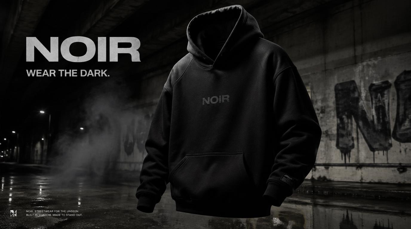 精选
精选NOIR 街头服饰 Campaign
Brand & Logos
精选NOIR 街头服饰 Campaign
Brand & Logos
Create a premium, highly realistic 1:1 campaign poster for NOIR, a modern streetwear brand. Show one hero oversized hoodie as the main focus against a gritty urban backdrop with wet concrete floors, dramatic low lighting, subtle smoke in the air and a raw street energy. Add bold minimal typography with the brand name NOIR and a short campaign headline like "Wear the Dark." Make it feel like a real high-end streetwear editorial, sharp detail, realistic fabric textures, modern and edgy, deep black tones with subtle grey accents, no clutter, no collage.
@Daniel_adsss
暂无图片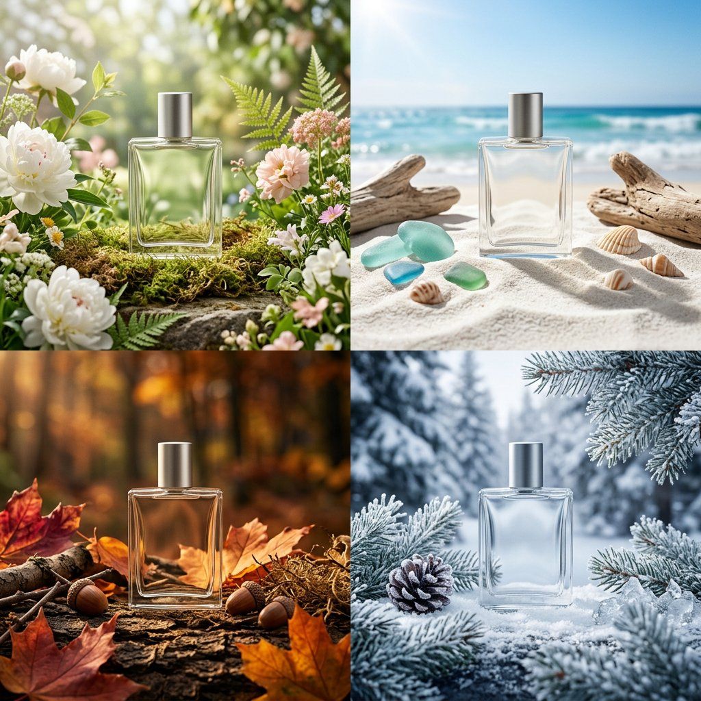
四季包装 Campaign 宫格
Brand & Logos
四季包装 Campaign 宫格
Brand & Logos
PHASE 1 - PRODUCT: [ITEM] in [MATERIAL] packaging, minimal label design PHASE 2 - GRID: 2x2 seasonal grid, four distinct brand worlds PHASE 3 - COMPOSITION: each quadrant a full campaign scene with props and environment PHASE 4 - CONSISTENCY: same product silhouette, four distinct palettes Swap: [ITEM] / [MATERIAL] / [LABEL STYLE]
@SRKDAN
暂无图片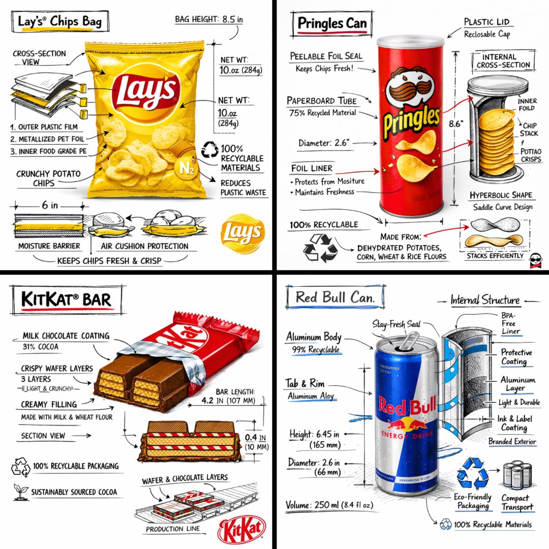 精选
精选零食品牌技术分解图
Brand & Logos
精选零食品牌技术分解图
Brand & Logos
[中文] 创建一个 [SNACK] 的品牌技术信息图,结合产品的真实照片或照片级真实渲染,并将技术注释覆盖层直接置于其上。在纯白摄影棚背景上使用带有策略性 [BRAND COLOR] 点缀的黑色墨水风格线条画(建筑草图外观),包括: • 关键组件标签 • 显示结构、分层或内部设计的内部截面图 • 测量数据、尺寸和规格 • 带有成分和数量的材料标注 • 指示主要功能和结构完整性的箭头 • 显示关键机械或设计元素的简单示意图或剖面图 • 可持续性标注 标题位置:位于手绘技术注释框内,带有强调色边框,粗体字显示产品名称,置于上角。 风格与布局规则: • 真实产品保持清晰可见 • 注释具有素描感、技术感和建筑感 • 强调色用于高光(占线条工作的 20-30%),黑色用于主要技术线条(70-80%) • 构图整洁,负空间平衡 • 具有教育意义、食品工程氛围和高端品牌感 • 在角落包含微妙的品牌标志 视觉风格:极简技术插画美学,黑色线条在真实图像上带有点缀,精确但略带手绘感。 调色板:白色背景,黑色注释线/文本,[BRAND COLOR] 仅用于点缀和关键标注。 输出:1080×1080,超清晰,社交媒体动态优化,无水印。 [English] Create a branded technical infographic of a [SNACK], combining a realistic photograph or photoreal render of the product with technical annotation overlays placed directly on top. Use black ink–style line drawings with strategic [BRAND COLOR] accents (architectural sketch look) on a pure white studio background, including: • Key component labels • Internal cross-section showing structure, layering, or internal design • Measurements, dimensions, and specifications • Material callouts with composition and quantities • Arrows indicating function for primary features and structural integrity • Simple schematic or sectional diagram showing key mechanical or design elements • Sustainability callouts Title placement: Inside a hand-drawn technical annotation box with accent border reading the product name in bold font, positioned in upper corner. Style & layout rules: • The realistic product remains clearly visible • Annotations feel sketched, technical, and architectural • Accents used for highlight (20-30% of linework), black for primary technical lines (70-80%) • Clean composition with balanced negative space • Educational, food-engineering vibe with premium branding • Include subtle brand logo mark in corner Visual style: Minimal technical illustration aesthetic, black linework with accents over realistic imagery, precise but slightly hand-drawn feel. Color palette: White background, black annotation lines/text, [BRAND COLOR] for accents and key callouts only. Output: 1080×1080, ultra-crisp, social-feed optimized, no watermark.
@TechieBySA
暂无图片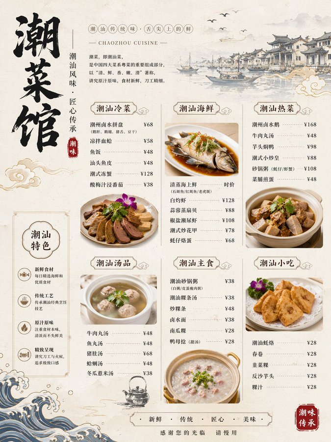
精美潮汕菜馆菜单图
Brand & Logos
精美潮汕菜馆菜单图
Brand & Logos
暂无图片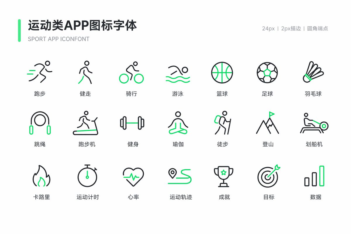
运动健身图标字体设计
Brand & Logos
运动健身图标字体设计
Brand & Logos
暂无图片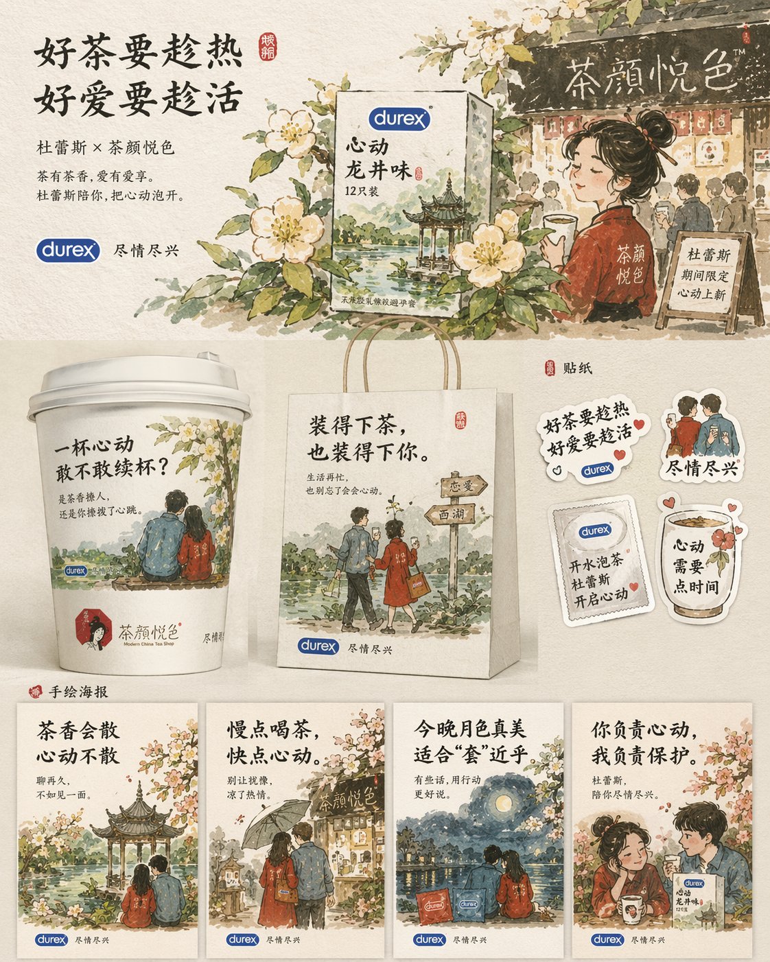
杜蕾斯茶颜悦色联名海报设计
Brand & Logos
杜蕾斯茶颜悦色联名海报设计
Brand & Logos
[中文] 设计一套杜蕾斯和茶颜悦色联名的宣传物料 [English] Design a set of promotional materials for a Durex and Chayan Yuese co-branding campaign.
@akokoi1
暂无图片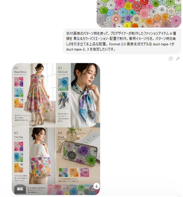
雅致图案四款时尚单品设计
Brand & Logos
雅致图案四款时尚单品设计
Brand & Logos
[中文] 使用附图中的图案,由专业设计师打造 4 款时尚单品,采用不同的色彩搭配与排版设计,附带穿搭效果图。以雅致的构图凸显图案的美感。格式为 2:3,希望将图像生成模型从 duct-tape-1 指定为 duct-tape-2、3。 [English] Use the patterns in the attached image, crafted by professional designers to create 4 fashion items, using different color schemes and layout designs, accompanied by outfit effect pictures. Highlight the beauty of the patterns with an elegant composition. The format is 2:3, hoping to specify the image generation model from duct-tape-1 to duct-tape-2, 3.
@aiehon_aya
暂无图片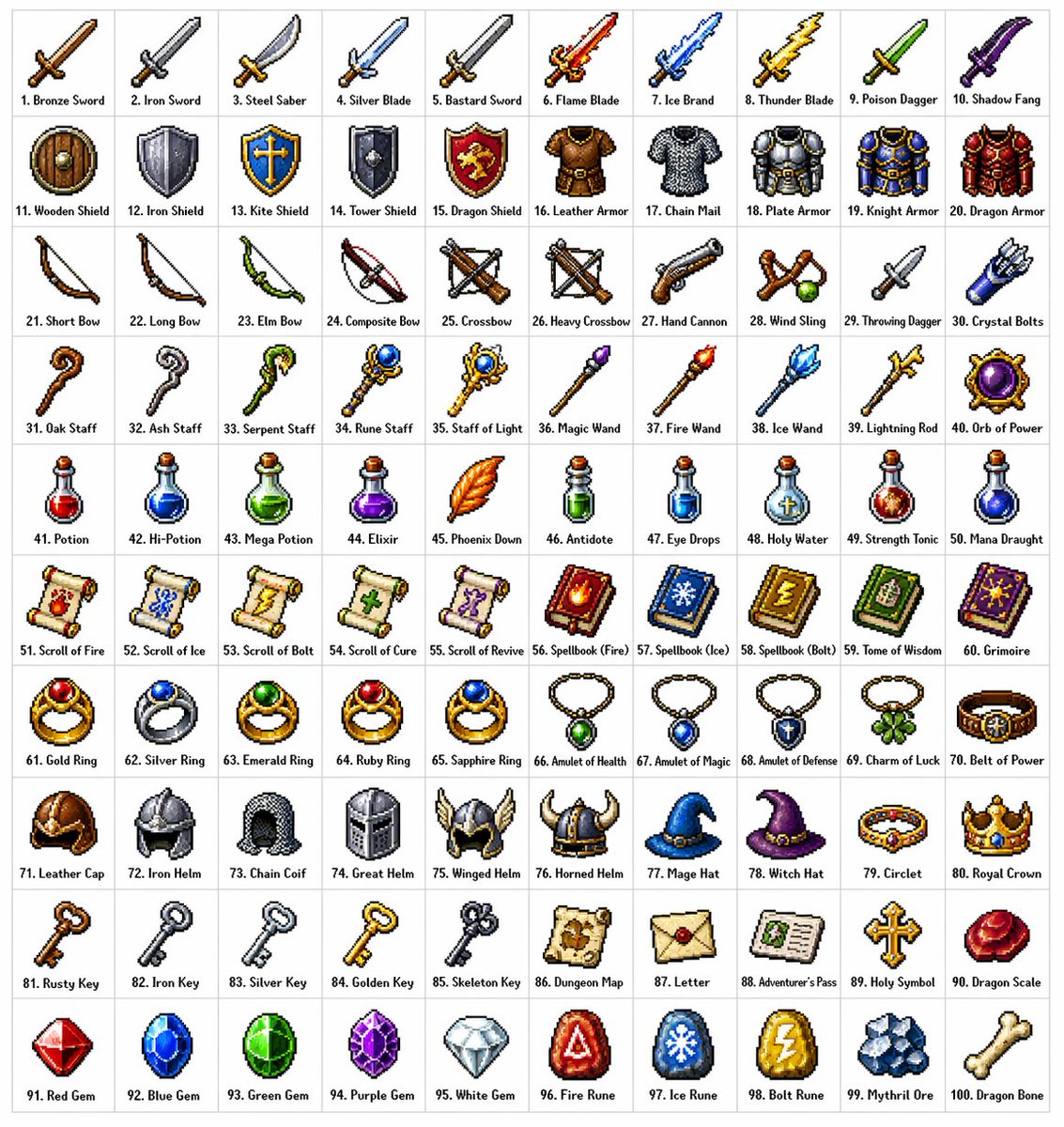
品牌视觉识别图
Brand & Logos
品牌视觉识别图
Brand & Logos
[中文] 创建一个包含100种不同奇幻RPG物品的10×10网格,以经典像素艺术风格渲染(16位或32位精灵图美学,让人联想到SNES/GBA时代的日式RPG)。每个物品应出现在其独立的方形瓷砖中,下方带有简短清晰的标签。在白色背景上保持网格整洁。使每个物品在视觉上都有所区分,并且每个标签拼写正确。使用清晰的像素边缘、每个精灵图有限的调色板,以及用于阴影的微妙抖动。 使用这些行主题: 第1行:剑与刀刃 第2行:盾牌与盔甲 第3行:弓、弩与远程武器 第4行:法杖、魔杖与魔法焦点 第5行:药水、灵药与烧瓶 第6行:卷轴、典籍与法术书 第7行:戒指、护身符与附魔小饰品 第8行:头盔、王冠与头饰 第9行:钥匙、遗物与任务物品 第10行:宝石、符文与制作材料 将每个瓷砖显示为干净背景方形上居中的物品精灵图,渲染为经典的库存图标——你在奇幻RPG菜单中会看到的那种。保持整体风格一致、连贯,并让人联想到备受喜爱的复古奇幻RPG——迷人、细节丰富,且在小尺寸下易于辨认。 [English] Create a 10 × 10 grid of 100 different fantasy RPG items rendered in classic pixel art style (16-bit or 32-bit sprite aesthetic, reminiscent of SNES/GBA-era JRPGs). Each item should appear in its own square tile with a short clear label underneath. Keep the grid neat on a white background. Make every item visually distinct and every label correctly spelled. Use crisp pixel edges, limited palette per sprite, and subtle dithering for shading. Use these row themes: Row 1: swords and blades Row 2: shields and armor Row 3: bows, crossbows, and ranged weapons Row 4: staves, wands, and magical foci Row 5: potions, elixirs, and flasks Row 6: scrolls, tomes, and spellbooks Row 7: rings, amulets, and enchanted trinkets Row 8: helmets, crowns, and headgear Row 9: keys, relics, and quest items Row 10: gems, runes, and crafting materials Show each tile as a centered item sprite on a clean background square, rendered as a classic inventory icon — the kind you'd see in a fantasy RPG menu. Keep the overall style consistent, cohesive, and reminiscent of beloved retro fantasy RPGs — charming, detailed, and instantly readable at small sizes.
@ProperPrompter
暂无图片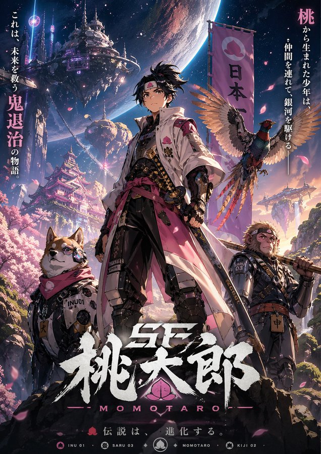
赛博科幻桃太郎主视觉图
Brand & Logos
赛博科幻桃太郎主视觉图
Brand & Logos
[中文] 设计虚构动画的钥匙视觉图。主题是「科幻桃太郎」。设计有魅力的角色、背景、标志和宣传语,以一幅美丽插画的形式完成,让世界观在一张图中传达出来。 [English] Design a key visual for a fictional animation. The theme is "Sci-Fi Momotaro". Design charming characters, backgrounds, logos, and promotional slogans, completed in the form of a beautiful illustration, allowing the worldview to be conveyed in a single image.
@SSSS_CRYPTOMAN
暂无图片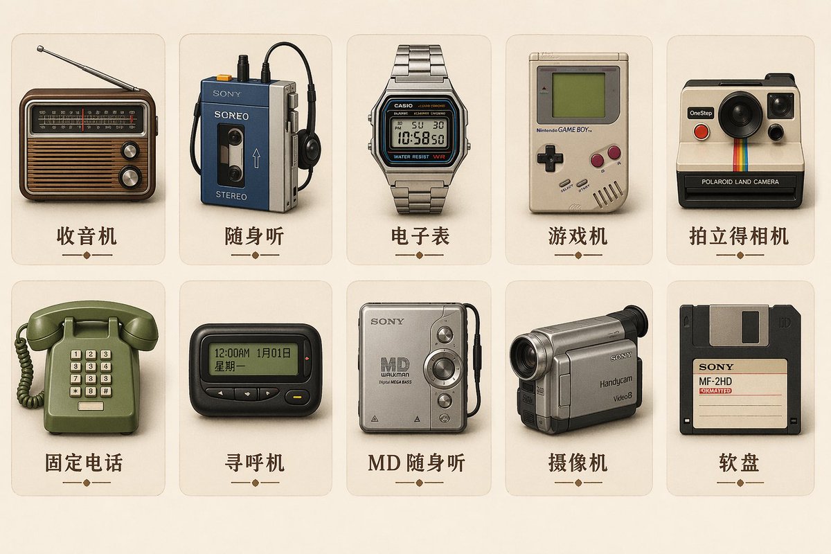
品牌吉祥物设定图
Brand & Logos
品牌吉祥物设定图
Brand & Logos
Generate a set of icons for {argument name="device" default="vintage electronic equipment"} in {argument name="style" default="retro skeuomorphic style"}, including icon names in the image.
@TanShilong
暂无图片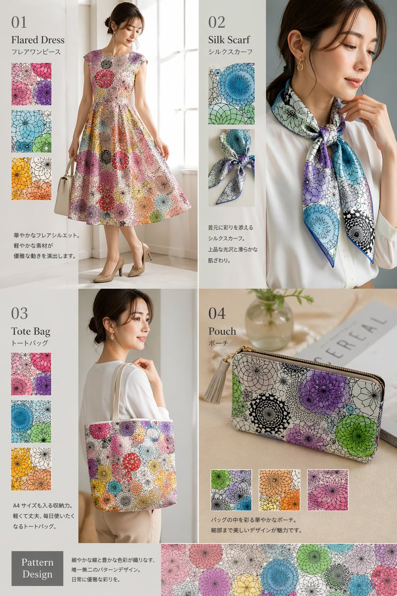
封面排版设计图
Brand & Logos
封面排版设计图
Brand & Logos
{ "type": "fashion product catalog layout", "theme": "A cohesive fashion collection featuring a specific pattern: {argument name=\"pattern description\" default=\"overlapping circular floral mandala motifs in purple, green, blue, orange, and pink\"}", "layout": { "structure": "2x2 grid with a full-width bottom banner", "sections": [ { "id": "01", "title": "{argument name=\"product 1\" default=\"Flared Dress\"}", "subtitle": "フレアワンピース", "main_image": "Woman in patterned flared dress holding white handbag.", "swatch_count": 3, "swatch_descriptions": ["purple variant", "green/blue variant", "orange/yellow variant"], "description_text": "華やかなフレアシルエット。軽やかな素材が優雅な動きを演出します。" }, { "id": "02", "title": "{argument name=\"product 2\" default=\"Silk Scarf\"}", "subtitle": "シルクスカーフ", "main_image": "Woman in white blouse with patterned silk scarf.", "swatch_count": 2, "swatch_descriptions": ["flat pattern detail", "tied knot detail"], "description_text": "首元に彩りを添えるシルクスカーフ。上品な光沢と滑らかな肌ざわり。" }, { "id": "03", "title": "{argument name=\"product 3\" default=\"Tote Bag\"}", "subtitle": "トートバッグ", "main_image": "Woman carrying patterned tote bag.", "swatch_count": 3, "swatch_descriptions": ["purple variant", "blue variant", "orange/yellow variant"], "description_text": "A4サイズも入る収納力。軽くて丈夫、毎日使いたくなるトートバッグ。" }, { "id": "04", "title": "{argument name=\"product 4\" default=\"Pouch\"}", "subtitle": "ポーチ", "main_image": "Patterned zip pouch on table with magazine and vase.", "swatch_count": 3, "swatch_descriptions": ["green/purple variant", "orange variant", "pink variant"], "description_text": "バッグの中を彩る華やかなポーチ。細部まで美しいデザインが魅力です。" } ], "bottom_banner": { "title": "Pattern Design", "description_text": "細やかな線と豊かな色彩が織りなす、唯一無二のパターンデザイン。日常に優雅な彩りを。", "image": "Horizontal strip showing the seamless pattern." } } }
@aiehon_aya
暂无图片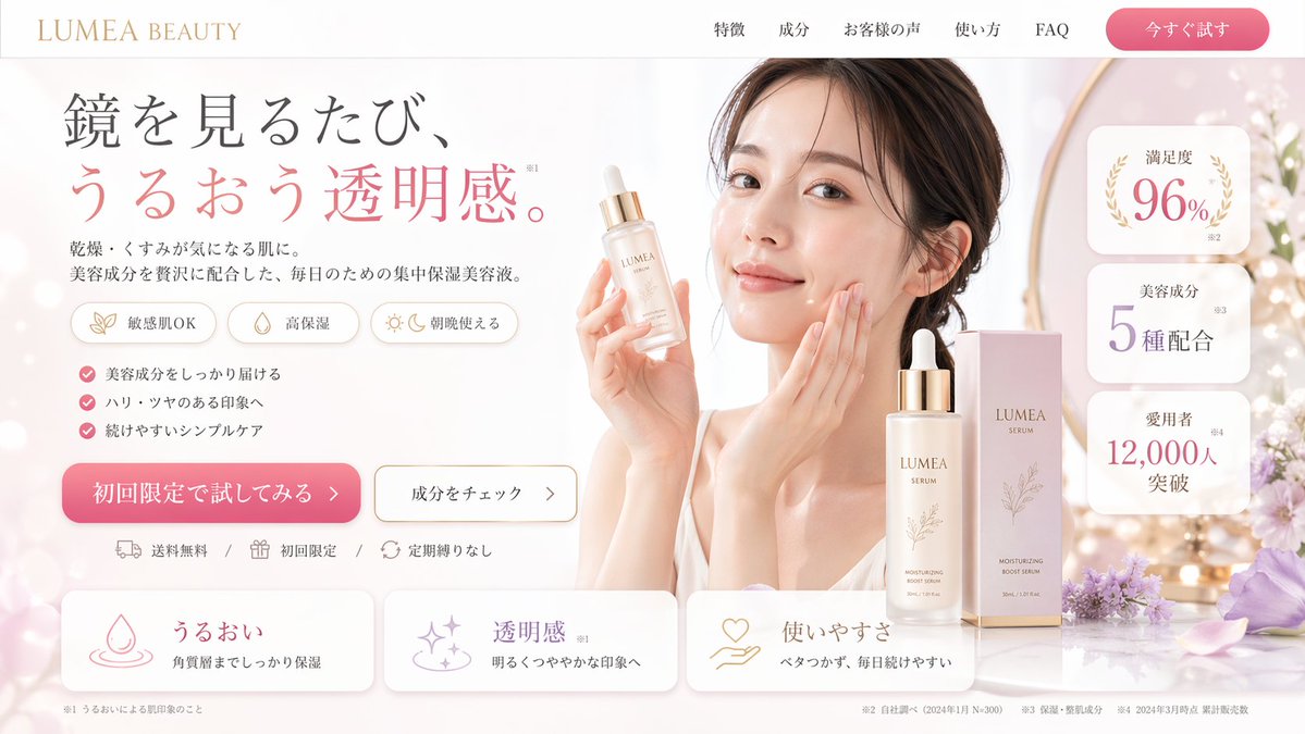
界面交互设计图
Brand & Logos
界面交互设计图
Brand & Logos
{ "type": "e-commerce landing page hero section mockup", "aesthetic": "clean, bright, airy, feminine, floral accents with purple flowers, {argument name=\"primary color\" default=\"soft pink\"} and white color palette, soft lighting", "header": { "logo": "{argument name=\"brand name\" default=\"LUMEA BEAUTY\"}", "navigation_links": { "count": 5, "labels": ["特徴", "成分", "お客様の声", "使い方", "FAQ"] }, "cta_button": "今すぐ試す" }, "hero_section": { "left_column": { "headline": "{argument name=\"headline text\" default=\"鏡を見るたび、うるおう透明感。\"}", "subheadline": "乾燥・くすみが気になる肌に。美容成分を贅沢に配合した、毎日のための集中保湿美容液。", "feature_badges": { "count": 3, "style": "pill-shaped with small icons", "labels": ["敏感肌OK", "高保湿", "朝晩使える"] }, "bullet_points": { "count": 3, "style": "pink checkmarks", "labels": ["美容成分をしっかり届ける", "ハリ・ツヤのある印象へ", "続けやすいシンプルケア"] }, "cta_buttons": { "count": 2, "labels": ["初回限定で試してみる >", "成分をチェック >"] }, "trust_badges": "送料無料 / 初回限定 / 定期縛りなし" }, "center_subject": { "model": "{argument name=\"model description\" default=\"young East Asian woman smiling, touching her cheek\"}", "action": "holding a dropper bottle of serum" }, "right_column": { "product_display": { "count": 2, "items": ["{argument name=\"product type\" default=\"moisturizing boost serum\"} dropper bottle", "packaging box"] }, "stat_cards": { "count": 3, "style": "floating white rounded rectangles with gold accents", "labels": ["満足度 96%", "美容成分 5種配合", "愛用者 12,000人突破"] } } }, "bottom_section": { "benefit_cards": { "count": 3, "style": "horizontal white rounded rectangles with icons", "labels": ["うるおい", "透明感", "使いやすさ"] } } }
@ryuya__31
暂无图片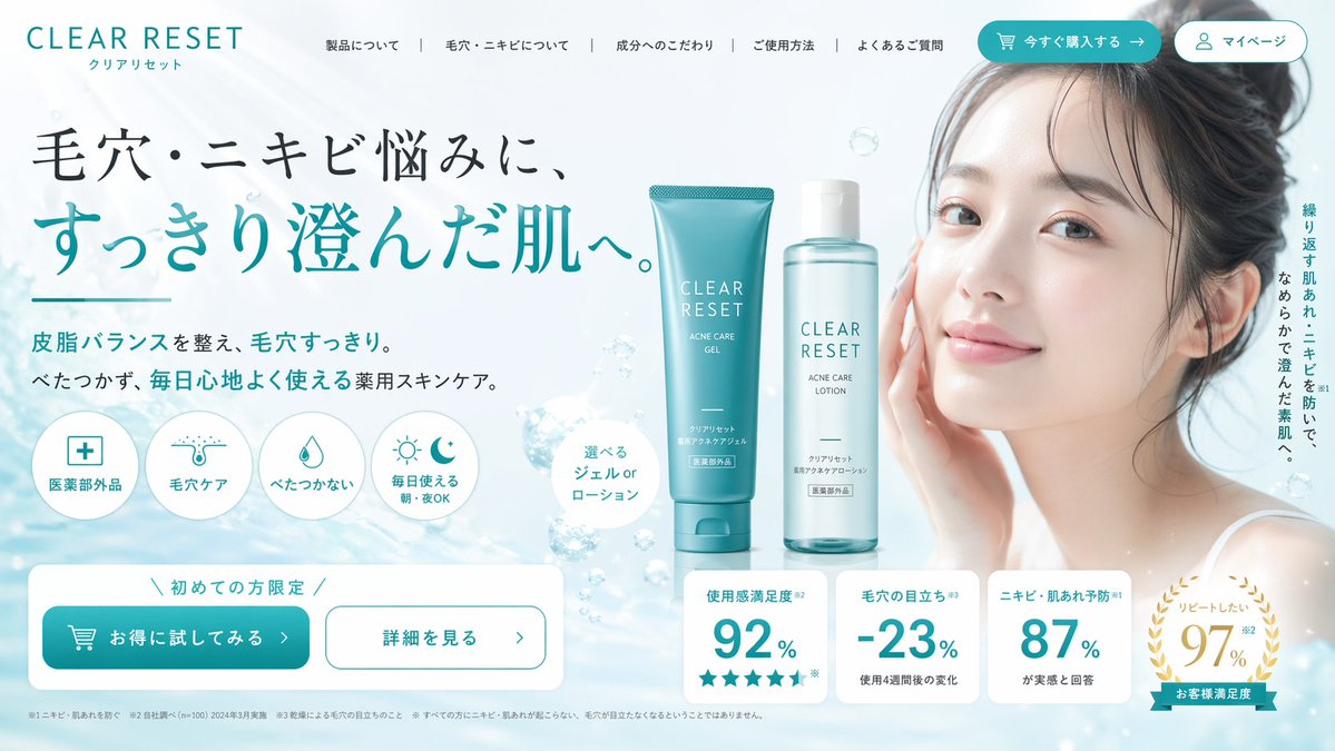
品牌视觉识别图
Brand & Logos
品牌视觉识别图
Brand & Logos
{ "type": "e-commerce landing page hero section", "brand": "{argument name=\"brand name\" default=\"CLEAR RESET\"}", "theme": "refreshing skincare, clean aesthetic, water bubbles background", "color_palette": ["white", "{argument name=\"primary color\" default=\"teal\"}", "light blue"], "layout": { "header": { "logo": "CLEAR RESET", "navigation_links": {"count": 5, "labels": ["About Product", "About Pores/Acne", "Ingredients", "How to Use", "FAQ"]}, "action_buttons": {"count": 2, "labels": ["Buy Now", "My Page"]} }, "hero_content": { "headline": "{argument name=\"main headline\" default=\"毛穴・ニキビ悩みに、すっきり澄んだ肌へ。\"}", "subheadline": "Balances sebum and clears pores. Non-sticky, medicated skincare for comfortable daily use.", "vertical_copy": "Prevents recurring rough skin and acne, leading to smooth, clear skin." }, "visuals": { "model": "{argument name=\"model description\" default=\"young Asian woman with clear radiant skin, hair tied up, smiling softly\"}", "products": { "count": 2, "description": "{argument name=\"product type\" default=\"acne care gel tube and lotion bottle\"}", "placement": "center" }, "background": "light blue gradient with floating water bubbles" }, "feature_highlights": { "count": 4, "style": "circular icons with text below", "labels": ["Quasi-drug", "Pore Care", "Non-sticky", "Daily Use Morning/Night OK"] }, "call_to_action": { "banner_text": "Limited to first-time buyers", "buttons": {"count": 2, "labels": ["Try it at a discount", "See details"]} }, "statistics_cards": { "count": 4, "style": "white rectangular cards with large teal numbers", "labels": ["Satisfaction 92%", "Pore visibility -23%", "Acne prevention 87%", "Want to repeat 97%"] } } }
@ryuya__31
暂无图片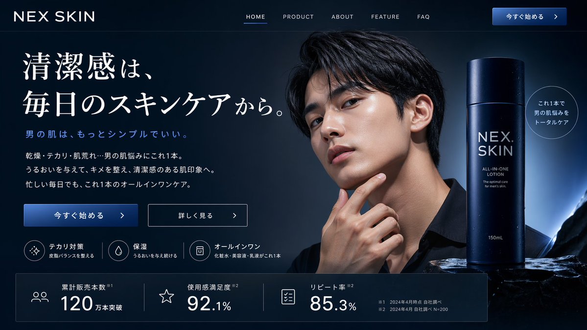
应用界面样机图
Brand & Logos
应用界面样机图
Brand & Logos
{ "type": "website landing page mockup", "theme": "men's skincare, sleek, professional, dark mode", "color_palette": "{argument name=\"color scheme\" default=\"dark navy blue\"}, white text, subtle blue gradients", "header": { "logo": "{argument name=\"brand name\" default=\"NEX SKIN\"}", "navigation": ["HOME", "PRODUCT", "ABOUT", "FEATURE", "FAQ"], "cta_button": "今すぐ始める >" }, "hero_section": { "left_column": { "headline": "{argument name=\"main headline\" default=\"清潔感は、毎日のスキンケアから。\"}", "sub_headline": "男の肌は、もっとシンプルでいい。", "body_text": "3 lines of descriptive text about skincare benefits", "buttons": [ {"style": "solid blue", "text": "今すぐ始める >"}, {"style": "outlined", "text": "詳しく見る >"} ], "feature_highlights": { "count": 3, "items": [ {"icon": "sparkle", "title": "テカリ対策", "subtitle": "皮脂バランスを整える"}, {"icon": "water drop", "title": "保湿", "subtitle": "うるおいを与え続ける"}, {"icon": "shield/bottle", "title": "オールインワン", "subtitle": "化粧水・美容液・乳液がこれ1本"} ] } }, "center_image": { "subject": "handsome {argument name=\"target demographic\" default=\"young Asian man\"}", "appearance": "clean-cut, dark hair, flawless glowing skin, wearing a black shirt", "pose": "hand touching chin thoughtfully", "lighting": "dramatic studio lighting highlighting facial structure" }, "right_column": { "product_shot": { "bottle": "tall cylindrical dark blue bottle with water droplets", "labels": ["{argument name=\"brand name\" default=\"NEX SKIN\"}", "{argument name=\"product type\" default=\"ALL-IN-ONE LOTION\"}", "150mL"], "base": "textured dark rock surface", "badge": "circular outlined badge reading 'これ1本で男の肌悩みをトータルケア'" } } }, "bottom_stats_bar": { "count": 3, "items": [ {"icon": "users", "label": "累計販売本数", "value": "120万本突破"}, {"icon": "star", "label": "使用感満足度", "value": "92.1%"}, {"icon": "checklist", "label": "リピート率", "value": "85.3%"} ], "footnotes": "small legal text on the right" } }
@ryuya__31
暂无图片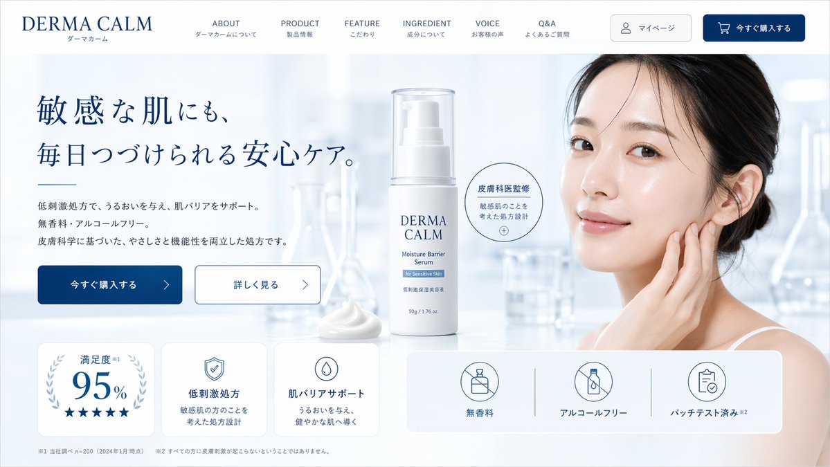
界面交互设计图
Brand & Logos
界面交互设计图
Brand & Logos
{ "type": "skincare e-commerce landing page mockup", "brand": "{argument name=\"brand name\" default=\"DERMA CALM\"}", "color_palette": ["white", "light blue", "{argument name=\"primary color\" default=\"dark blue\"}"], "layout": { "header": { "logo": "left-aligned brand name with Japanese subtext", "navigation_links": { "count": 6, "labels": ["ABOUT", "PRODUCT", "FEATURE", "INGREDIENT", "VOICE", "Q&A"] }, "buttons": { "count": 2, "labels": ["マイページ", "今すぐ購入する"] } }, "hero_section": { "left_column": { "headline": "{argument name=\"hero headline\" default=\"敏感な肌にも、毎日つづけられる安心ケア。\"}", "subtext": "paragraph detailing low irritation, moisturizing, fragrance-free, and alcohol-free benefits", "buttons": { "count": 2, "labels": ["今すぐ購入する", "詳しく見る"] } }, "center_column": { "product": "white pump bottle with clear cap labeled {argument name=\"product type\" default=\"Moisture Barrier Serum\"}", "props": ["dollop of white cream", "circular badge reading 皮膚科医監修"] }, "right_column": { "subject": "{argument name=\"model description\" default=\"young East Asian woman with clear glowing skin touching her cheek\"}", "background": "blurred laboratory glassware in a bright, clean clinical setting" } }, "bottom_features_panel": { "left_cards": { "count": 3, "descriptions": ["95% satisfaction with 5 stars", "shield icon for low irritation formula", "drop icon for skin barrier support"] }, "right_badges": { "count": 3, "descriptions": ["no fragrance icon", "no alcohol icon", "patch tested icon"] }, "footer": "fine print disclaimers at the bottom" } } }
@ryuya__31
暂无图片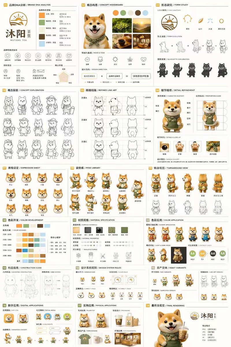
界面交互设计图
Brand & Logos
界面交互设计图
Brand & Logos
{ "type": "18-panel brand identity and character design document", "brand": { "name": "{argument name=\"brand name\" default=\"沐阳 MUYANG TEA\"}", "industry": "{argument name=\"industry\" default=\"tea shop\"}", "colors": ["{argument name=\"primary color\" default=\"yellow\"}", "{argument name=\"secondary color\" default=\"green\"}", "white", "brown", "dark green"] }, "subject": "{argument name=\"character description\" default=\"3D rendered cute Shiba Inu mascot wearing a green apron\"}", "layout": { "grid": "3 columns by 6 rows", "sections": [ { "title": "01 品牌DNA分析 / BRAND DNA ANALYSIS", "elements": ["logo", "5 color swatches", "6 icons", "target audience charts"] }, { "title": "02 概念构思 / CONCEPT MOODBOARD", "elements": ["5 photo references", "4 mood icons", "design equation"] }, { "title": "03 形态研究 / FORM STUDY", "elements": ["4 logo anatomy icons", "4 evolution steps", "4 silhouettes"] }, { "title": "04 概念探索 / CONCEPT EXPLORATION", "elements": ["12 line-art character sketches"] }, { "title": "05 精细线稿 / REFINED LINE ART", "elements": ["3 rows of front and side line art with proportion guides"] }, { "title": "06 细节精修 / DETAIL REFINEMENT", "elements": ["2 full-body renders with labels", "4 circular close-ups"] }, { "title": "07 表情设定 / EXPRESSION SHEET", "elements": ["11 3D rendered head expressions"] }, { "title": "08 姿势库 / POSE LIBRARY", "elements": ["9 full-body 3D rendered poses"] }, { "title": "09 转身视图 / TURNAROUND VIEW", "elements": ["5 full-body 3D renders", "5 matching line-art views"] }, { "title": "10 色彩开发 / COLOR DEVELOPMENT", "elements": ["5 rows of 5-color palettes", "color psychology text"] }, { "title": "11 材质规格 / MATERIAL SPECIFICATION", "elements": ["5 texture swatches", "property sliders", "4 manufacturing icons"] }, { "title": "12 色彩应用 / COLOR APPLICATION", "elements": ["4 color variant renders", "2 light/dark renders", "4 contrast rating circles"] }, { "title": "13 构造指南 / CONSTRUCTION GUIDE", "elements": ["2 line-art diagrams for geometry and grid"] }, { "title": "14 设计系统规则 / DESIGN SYSTEM RULES", "elements": ["minimum size icons", "clear space diagram", "4 usage examples"] }, { "title": "15 资产变体 / ASSET VARIANTS", "elements": ["3 size variants", "3 line-art variants", "3 simplified flat heads"] }, { "title": "16 数字应用 / DIGITAL APPLICATIONS", "elements": ["1 app icon", "2 social avatars", "UI elements", "3-step animation cycle"] }, { "title": "17 实物应用 / PHYSICAL APPLICATIONS", "elements": ["plush toy mockup", "packaging mockup", "merchandise mockup", "storefront mockup"] }, { "title": "18 最终主视觉 / FINAL RENDERING", "elements": ["large high-res 3D render of mascot holding tea", "logo", "file format list"] } ] } }
@Colin_Leeee
暂无图片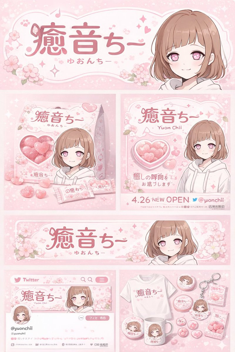
界面交互设计图
Brand & Logos
界面交互设计图
Brand & Logos
{ "type": "brand identity and merchandise design board", "theme": { "color_palette": "{argument name=\"theme color\" default=\"pastel pink\"} and white", "motif": "{argument name=\"motif\" default=\"cherry blossoms\"} and pink hearts" }, "character": { "description": "anime girl with short brown bob hair, pink eyes, wearing a white hoodie, gentle smile" }, "branding": { "main_logo": "{argument name=\"character name\" default=\"癒音ちー\"}", "sub_logo": "{argument name=\"character subtext\" default=\"ゆおんちー\"}" }, "layout": { "sections": [ { "type": "header banner", "position": "top", "elements": ["large main logo", "sub logo", "cherry blossom graphics", "character portrait on the right"] }, { "type": "product packaging", "position": "middle left", "elements": ["1 square box with heart-shaped transparent window showing pink heart candies", "character illustration on box", "2 individual candy wrappers", "5 scattered heart candies"] }, { "type": "promotional poster", "position": "middle right", "elements": ["character portrait", "heart-shaped candy bowl", "main logo", "text '4.26 NEW OPEN'", "text '{argument name=\"social handle\" default=\"@yuonchii\"}'"] }, { "type": "horizontal web banner", "position": "lower middle", "elements": ["main logo", "cherry blossoms", "character portrait on the right"] }, { "type": "social media profile mockup", "position": "bottom left", "elements": ["header image with logo", "1 circular profile picture", "handle '{argument name=\"social handle\" default=\"@yuonchii\"}'", "1 follow button", "mock bio text"] }, { "type": "merchandise collection", "position": "bottom right", "count": 9, "items": ["1 white t-shirt with logo", "1 white mug with character", "4 round pin badges", "1 acrylic keychain", "2 candy packets"] } ] } }
@chi_vc_